The goblet is cracked
Beatrice Warde versus Venturi and Scott Brown: why design is never invisible – but can be quiet
- Number
- Nr. 001
- Type
- writing
- Year
- File
- kachel-der-kelch-hat-einen-sprung.jpg
Design is never invisible. It can be quiet – but quiet is not the same as transparent. Between those two words lies one of the most productive arguments in design history, and it hasn’t been settled.
On one side stands a wine glass. On the other, a sign beside a road in Nevada.
Two goblets
In 1930 Beatrice Warde gives a lecture to typographers in London. Warde is American, works for the Monotype Corporation and is one of the most influential voices in book typography of her time. Her image is so simple that it still appears in textbooks: in front of you stand two goblets of wine. One is of solid gold, elaborately decorated. The other is of glass, thin and clear. Whoever loves wine chooses the glass – because it hides nothing.
Typography, Warde says, should be that glass. Her lecture later appears under the title that became a slogan: Printing should be invisible. Type is a window, not a picture. Whoever notices the letters while reading is distracted from the thought.
This is no naive argument. Anyone who has had to read a long text in an overly conspicuous typeface knows she is right. A timetable, a package insert, a novel: here form serves content, and every vanity of design costs the reader effort. Fifty years later Dieter Rams carried the same thought over to products: good design is as little design as possible.
The crack in the glass
And yet the goblet is cracked. The crack lies in the assumption that there could be a neutral vessel.
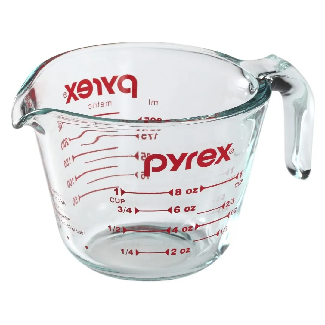
Fig. 1 — Glass measuring jug. The lettering is tool and sender at once.
Take the most glass-like object a kitchen has to offer: a Pyrex measuring jug. It doesn’t get more transparent. And yet it is full of lettering – the scale, the brand name, printed in red. Without the lettering it would just be a glass. Here the lettering isn’t decoration; it is the function. And it is also the brand. The jug shows what Warde’s image keeps quiet: even the clearest vessel speaks, and in a voice someone chose.
That goes for her own example too. The “invisible” book typography Warde defends is a very particular style – the roman of the English book tradition, set according to rules you have to learn. It only seems invisible to those who grew up with it. And Warde didn’t speak as a neutral observer but as the voice of a company that sold exactly these typefaces. That doesn’t make her argument wrong. But it shows: invisibility, too, is a decision, and decisions become visible as soon as you are used to something else.
The duck and the shed
Forty years after Warde’s lecture, Robert Venturi, Denise Scott Brown and Steven Izenour travel to Las Vegas with students from Yale. What they study there was considered by architects to be the opposite of design: the Strip, the neon signs, the parking lots, the interchangeable halls behind them. Their book Learning from Las Vegas appears in 1972, and it turns Warde’s question around. Not: how does form disappear behind content? But: what if the sign is the content?
They distinguish two kinds of buildings. The duck is a building whose entire form is a sign – named after a shop on Long Island that sold ducks and itself had the shape of a duck. The decorated shed is a neutral hall whose meaning comes from a sign placed in front of it. Modernism, so the argument goes, built ducks and took them for honest. The shed with a sign is more honest: it openly says that meaning is applied.
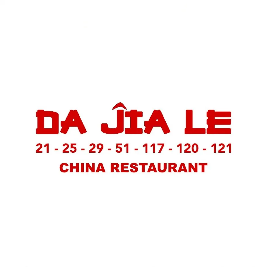
Fig. 2 — Name, numbers, category: the language of the roadside sign.
This is the moment the everyday enters theory. As early as 1966, in Complexity and Contradiction in Architecture, Venturi had argued against the purity of modernism, with a phrase parodying Mies van der Rohe’s “Less is more”: Less is a bore. In Las Vegas this becomes a method: look before you judge. The sign of the Chinese restaurant round the corner, the numbered list of dishes, the lettering a print shop set in twenty minutes – all of this is communication that works without a designer having approved of it.
Part of this book’s history is also who gets named. In 1991 the Pritzker Prize went to Venturi alone, although Denise Scott Brown had decisively shaped the Las Vegas study. Anyone who talks about visibility in design shouldn’t pass over that gap.
Readymade ± 3 %
Warde is right that form can recede. Venturi and Scott Brown are right that it never disappears in the process. My own work stands right between the two, and I believe the more interesting question lies there: what happens if you take the sign – the label, the indication of origin, the placeholder – and shift it just a little?
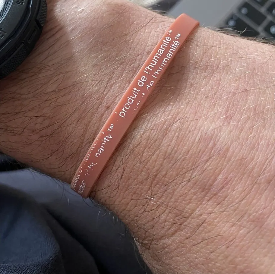
Fig. 3 — product of humanity™, 2026. An indication of origin from asparagus, transferred to people.
A bunch of asparagus had a rubber band with the words “product of mexico”. A decorated shed in miniature: a neutral thing given meaning by a sign. I kept the sign and swapped one word. The indication of origin became product of humanity™ – and whoever wears the band declares themselves a product. That is the method Marcel Duchamp introduced in 1917 with a urinal and that Virgil Abloh translated for design as the three percent rule: the found object stays almost unchanged; the small intervention tips the meaning.
The PNG grid that lies behind every tile on this website belongs here too. It is the sign software uses to say “there is nothing here”. A pattern for absence that everyone recognises who has ever cut out an image. So invisibility has long had a form – you only have to show it.
What follows for practice
I would derive three working rules from the argument:
- Distinguish between reading and seeing. Where people read – running text, wayfinding, forms – Warde is right. Here restraint is a duty to the reader.
- Take the found object seriously before you replace it. The sign, the label, the scale often carry more meaning than whatever you would put in their place. Venturi’s looking is a form of research.
- If you intervene, do it in one place. Silence isn’t disappearance but the stage for the one intervention that counts. The tile for this text sets the word Printing yellow on yellow, almost invisible – and that is exactly why you look for it.
Warde’s goblet remains a good tool. You should just know that you are holding it – and that it has a crack the light falls through.