The 3 % are not a quantity but a threshold
Virgil Abloh, Marcel Duchamp and psychophysics: why the smallest effective change depends on the viewer
- Number
- Nr. 002
- Type
- writing
- Year
- File
- kachel-die-drei-prozent-sind-eine-schwelle.jpg
Virgil Abloh liked to explain his work with a number: three percent. In the usual short form: take something that already exists, change it by three percent, and it’s yours. That is so catchy that it is now quoted as a rule, as if it had been measured.
It hasn’t been measured. And that is exactly what makes it interesting. My thesis: the three percent are not a quantity you weigh out. They are a threshold – the point at which an intervention is just noticed. Where that point lies is decided not by the object but by the eye of whoever looks at it.
A number without justification
On 26 October 2017 Abloh gives a lecture at the Harvard Graduate School of Design titled Insert Complicated Title Here. On an early slide he lists his “Personal Design Language”, seven points. The first is Readymade, the third 3 % approach. No justification is given. The seventh point, by the way, reads: be tourist and purist at the same time. I’ll come back to that.
A year later Nike publishes TEXTBOOK, the workbook for Abloh’s collection The Ten. There the number softens. With the Air Jordan I, which he cuts open with a box cutter, he speaks of “reductive design instead of additive design”. With the Blazer he says it is neither about super reductive nor super additive: “It’s just that ten percent …” And he describes the effect: close your eyes, draw the familiar thing from memory – then you notice it is “a little bit off”.
Three percent, ten percent, sometimes added, sometimes cut away. Abloh was no accountant. He described an order of magnitude, not a recipe. He got his legal cover, as he told 032c magazine in 2018, from Marcel Duchamp: “Duchamp is my lawyer.”
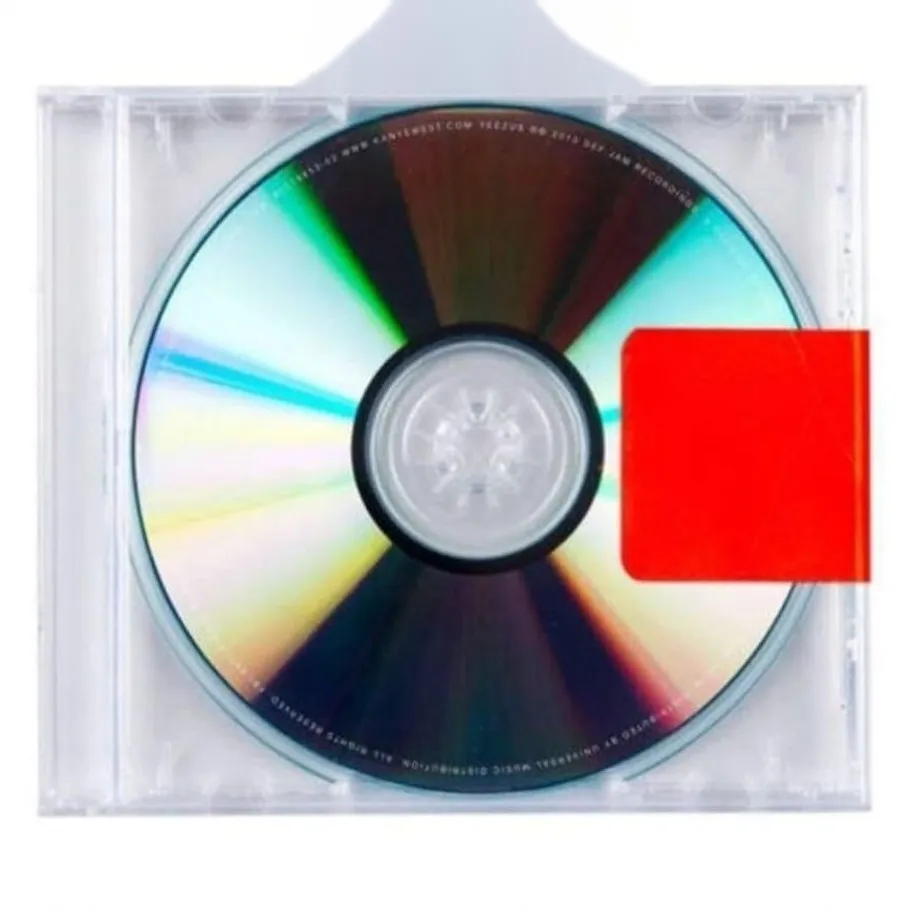
Fig. 1 — The case of Kanye West’s album Yeezus (2013): a clear standard case without artwork and a strip of tape. Abloh, then part of West’s creative agency DONDA, described it in 2017 at Columbia University as “the death of a CD”.
The Yeezus case shows how little is needed. No cover, no booklet, hardly more than the clear standard box, a red strip and the most necessary stickers. Almost everything was taken away, hardly anything added. The result is instantly recognisable as a CD – and instantly a statement about the CD.
A thirtieth, a fiftieth
If the number isn’t a recipe, where does the feeling come from that it is right? One answer lies not in design history but in nineteenth-century perception research.
The Leipzig physiologist Ernst Heinrich Weber places weights in his subjects’ hands and asks when they feel a difference. His finding: what matters is not the absolute increase but the ratio. Whether you notice the difference depends on whether the addition amounts to a thirtieth or a fiftieth of the weight. That is two to just over three percent. In 1860, in the Elemente der Psychophysik, Gustav Theodor Fechner turns this into a law and a term: the difference threshold. Below it a difference exists, but not consciously.
So Abloh’s three percent lie in the order of magnitude of a measured threshold. One shouldn’t make more of it than that. For the measurements also show that there is no fixed number. The information theorist Abraham Moles, to whom I’ll come in a moment, summarises them in 1958: for pitch the threshold averages half a percent, for loudness around ten percent. Weber reports draughtsmen who could distinguish lines differing by one millimetre in a hundred, others only by five – he attributes this to visual acuity. And Fechner notes that thresholds fluctuate with fatigue, habituation and practice.
The limit of the argument matters too: Weber and Fechner measure sensory stimuli, not meaning. That a shift in meaning follows a similar logic is my hypothesis, not a finding. But it has one advantage over the fixed number: it explains why the same three percent fizzle out with one object and hit home with the next.
A little too much
The next step is taken by Moles himself, a Frenchman who applies information theory to art. In 1958 he publishes Théorie de l’information et perception esthétique. His model has two poles. Redundancy is what the receiver already knows; it ensures that something is recognised. Originality is the unpredictable; it makes a message valuable. If everything is known, it becomes banal – Moles compares this with pictures on postage stamps. If everything is new, the receiver rejects it. Art, Moles writes, gives the viewer “a little too much” originality: a bit more than they can comfortably process, but not much more.
The decisive sentence comes before that: redundancy is the receiver’s prior knowledge, and that is different for everyone. What is a quotation for one person, another sees for the first time. With that, the threshold moves from the object to the viewer.

Fig. 2 — adidas Yeezy Powerphase Calabasas, 2017: a tennis shoe from the eighties plus one word in gold foil. The intervention only works because the original is recognised at once.
Max Bense, the Stuttgart philosopher, formulated the same thought for advertising in his Aesthetica of 1965: whoever wants to say something new has to give it “ballast of trivial meaning” (my translation of Ballast aus trivialer Bedeutung). Without the familiar, the new doesn’t get through. The Powerphase is a good example. A shoe you know, a word you don’t expect in that place. The familiar carries the new.
There is a serious objection to Moles, and it belongs here. In Entropy and Art (1971), Rudolf Arnheim considers information-theoretical aesthetics largely unproductive. If information is measured by improbability and at the same time counts as a measure of order, then complete disorder conveys a maximum of order. Arnheim calls this a “Babylonian muddle”. Using a depiction of the Madonna, he shows that meaning arises from the interplay of order and deviation, not from deviation alone. I read this as a condition for the method: the small shift only carries if the order it departs from is strong enough. An object nobody knows can’t be changed by three percent.
Two things from the same mould
Back to Duchamp, the lawyer. He is usually remembered for the urinal of 1917, which he declared a work of art without changing it. That isn’t quite true: the urinal was turned over and signed. And in other works Duchamp intervened minimally – he called this “readymade aided”, the assisted readymade.
More important for the threshold are notes published only in 1980, twelve years after his death. In them Duchamp circles a term he had already used in an aphorism in 1945 and calls infra-mince, roughly “infra-thin”. The warmth of a chair someone has just got up from is infra-mince. And then a note familiar to anyone who has ever had something manufactured: the dimensional difference between two objects from the same mould is infra-mince once the highest precision has been reached. Duchamp even tries to measure the infra-mince, asking about a tenth of a millimetre and about the measuring instruments of the trades.
He doesn’t use the word tolerance. In substance he describes it. In manufacturing the sign for it is ±: the range within which a part still counts as the same part. Elsewhere Duchamp writes that the passage from the possible to becoming happens in the infra-mince – the tubes of paint that could become a Seurat. That is, in a note, the tipping point I’m looking for.
A second passage belongs here. In his 1957 lecture The Creative Act, Duchamp says the artist does not perform the creative act alone. The spectator “adds his contribution”. In 1993 the cartoonist Scott McCloud spelled this out for sequences of images: we see two panels and fill in what happens in the empty space between them. If the viewer collaborates, the threshold lies with them too.
The objection: the frame is enough
The strongest counter-position comes from the philosopher Boris Groys. In Über das Neue (1992) he distinguishes between the new and the merely other. In an essay of 2002 he sharpens this: a difference you recognise is already remembered, and therefore not new. A profane thing only becomes new when it crosses the border into the cultural archive – the museum, the collection. That doesn’t necessarily require a formal change, but a frame. The less a work visibly differs from the everyday thing, the more necessary the separation by context becomes. In Becoming an Artwork (2023) he puts it briefly: “it is the frame that makes an image.”
Appropriation art tried this out radically. In 1981 Sherrie Levine photographed photographs by Walker Evans and exhibited them under her own name – zero percent change, full shift of meaning. The poet Kenneth Goldsmith, founder of the online archive UbuWeb, gave his 2020 book on appropriation and copyright Abloh’s sentence as its title: Duchamp Is My Lawyer.
Groys is right that the frame does work. But he also describes where the tension comes from: the profane object and its cultural claim both remain recognisable and never quite merge. The tension fades when the cultural claim is withdrawn or the profane is too reminiscent of what has already been valorised. This is where my position begins. Design rarely has a museum as its frame. A shoe, a label, a CD case stand on the shelf among a thousand others. There the difference itself has to become visible – just enough for someone to pause.
Fig. 3 — Neon-yellow tape. On this website it holds every tile at its edge: a frame that says “this has been selected”.
That is why I work with both. The PNG grid and the tape on this website are frames in Groys’ sense: they mark an everyday thing as selected. The intervention itself stays small and visible. Readymade ± 3 % lies exactly on the border between the new and the other – so small that the intervention almost remains context, just large enough to be noticed.
Find the threshold, don’t measure it
That is why I put the plus-minus in front of the number. Readymade ± 3 % means: the three percent are Abloh’s order of magnitude; the ± is the tolerance within which the thing is still itself. The number names no amount you weigh out, but a limit you look for anew with each object. Whether you add, remove or swap something is open. It remains one intervention.
That has consequences for the work. First: the order must be strong. Only what is recognised in a second can bear a shift. Second: the threshold depends on the audience. Whoever has known an object for years sees a millimetre; whoever sees it for the first time needs a centimetre. That isn’t subjective but relative to prior knowledge. Here Abloh’s seventh point gains weight: being tourist and purist at once means designing for both thresholds. The purist recognises the quotation, the tourist the image. Third: the limit is delicate. Bense calls the aesthetic state extremely fragile. The same few percent that create meaning can also destroy it, and one step too far turns the quotation into a copy or a caricature.
You can practise this. Take an object everyone knows and show it to two people – one who uses it every day and one who barely notices it. Change it in small steps. The point at which one hesitates and the other still sees nothing is your tolerance. That is where the work lies.