Denttabs
A brand as clear as its product: rebranding the toothpaste tablet in six months
- Type
- project
- Year
- Medium
- Brand system, packaging, point of sale
- File
- denttabs-brand-guidelines_1.jpg
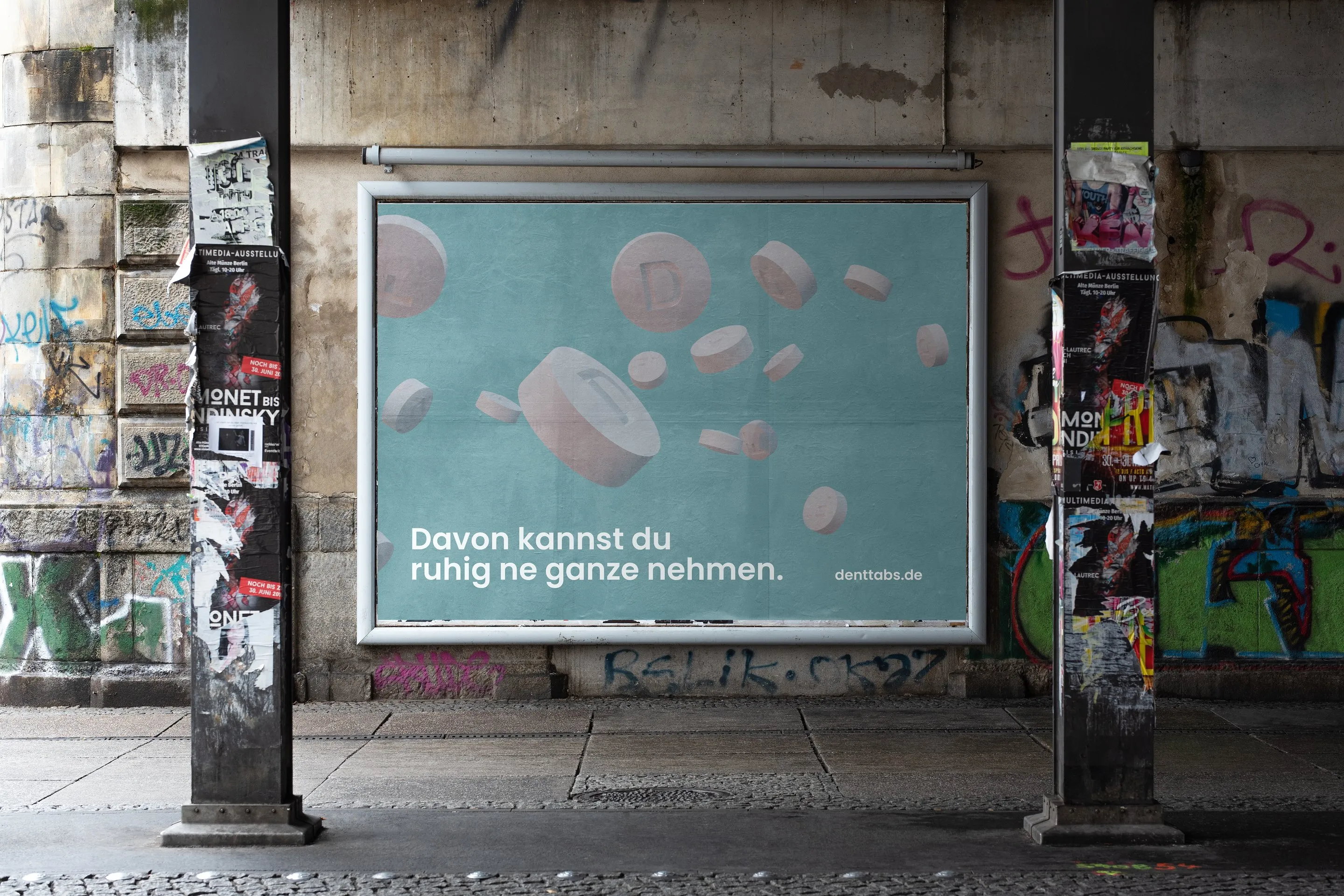
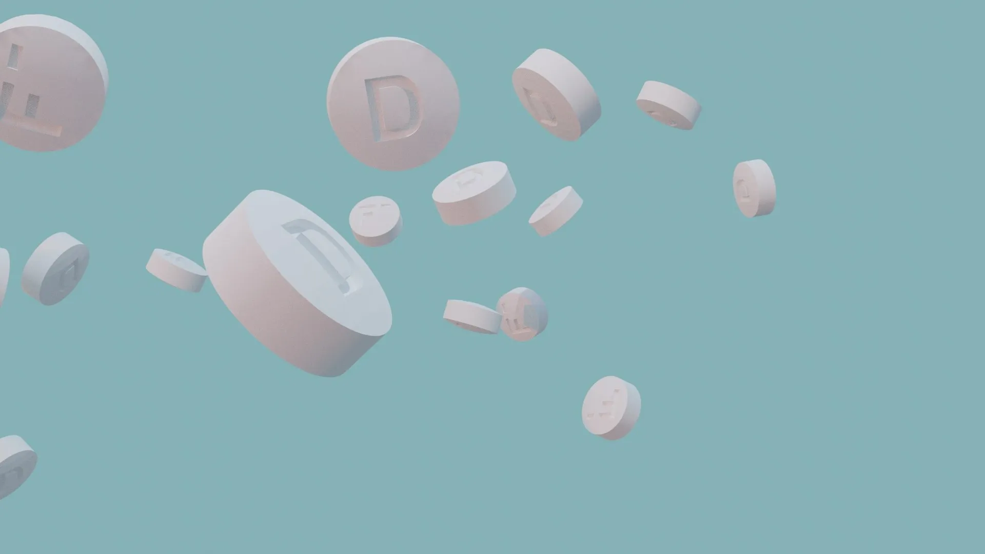
Denttabs makes toothpaste tablets: you chew a tablet, brush as usual, and the plastic tube disappears. When I joined as Senior Art Director in June 2021, the product was far ahead of its brand. The design looked like an eco label for insiders, the full-colour packaging was expensive to print, and on the shelf the pack vanished next to the established oral-care brands.
The task: order, not a new coat of paint
A rebrand could have started from zero. I decided against it. First came an audit: what worked in the old brand stayed. What was missing was a system that works the same on every pack, every shelf and every screen.
The decision: the pack as a data sheet
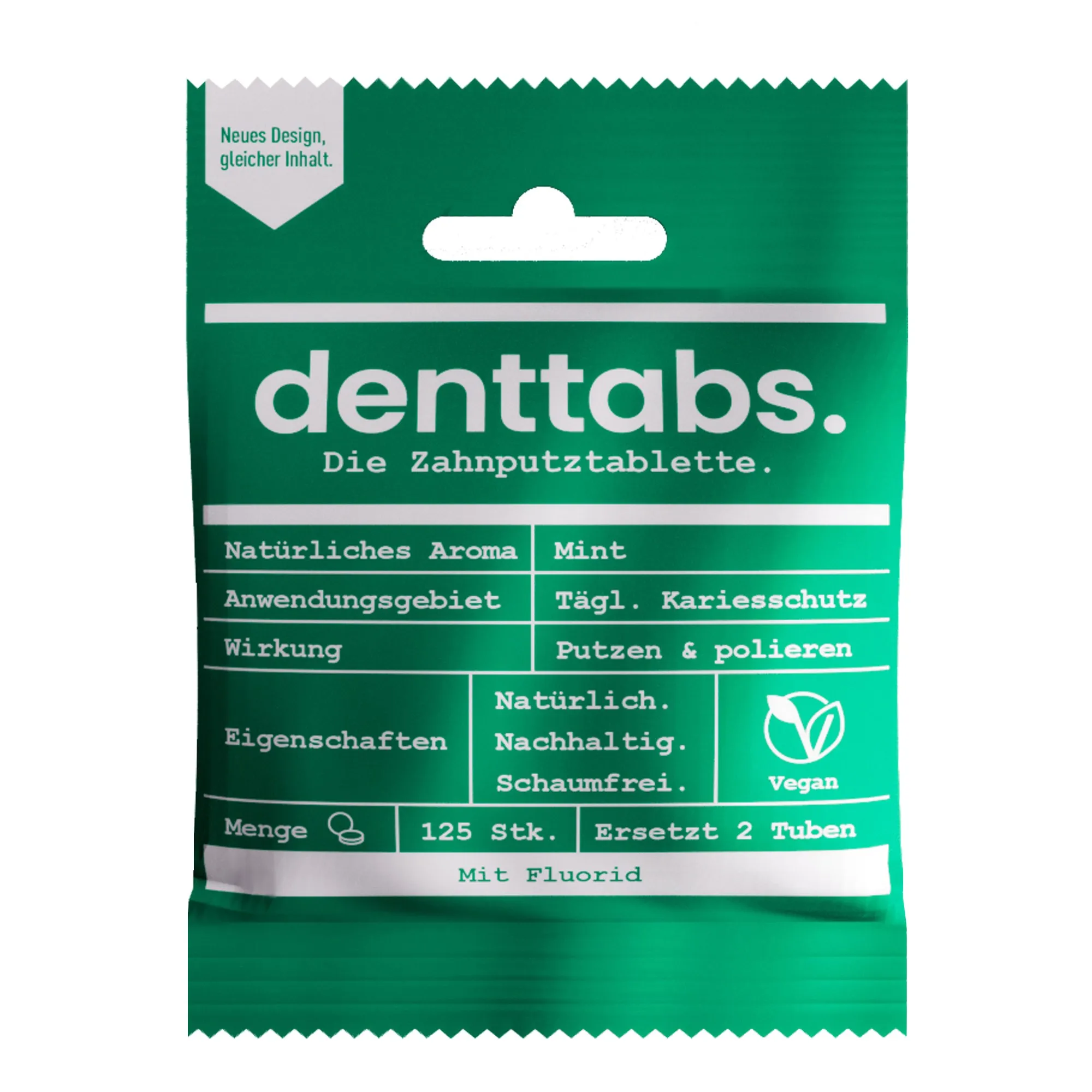
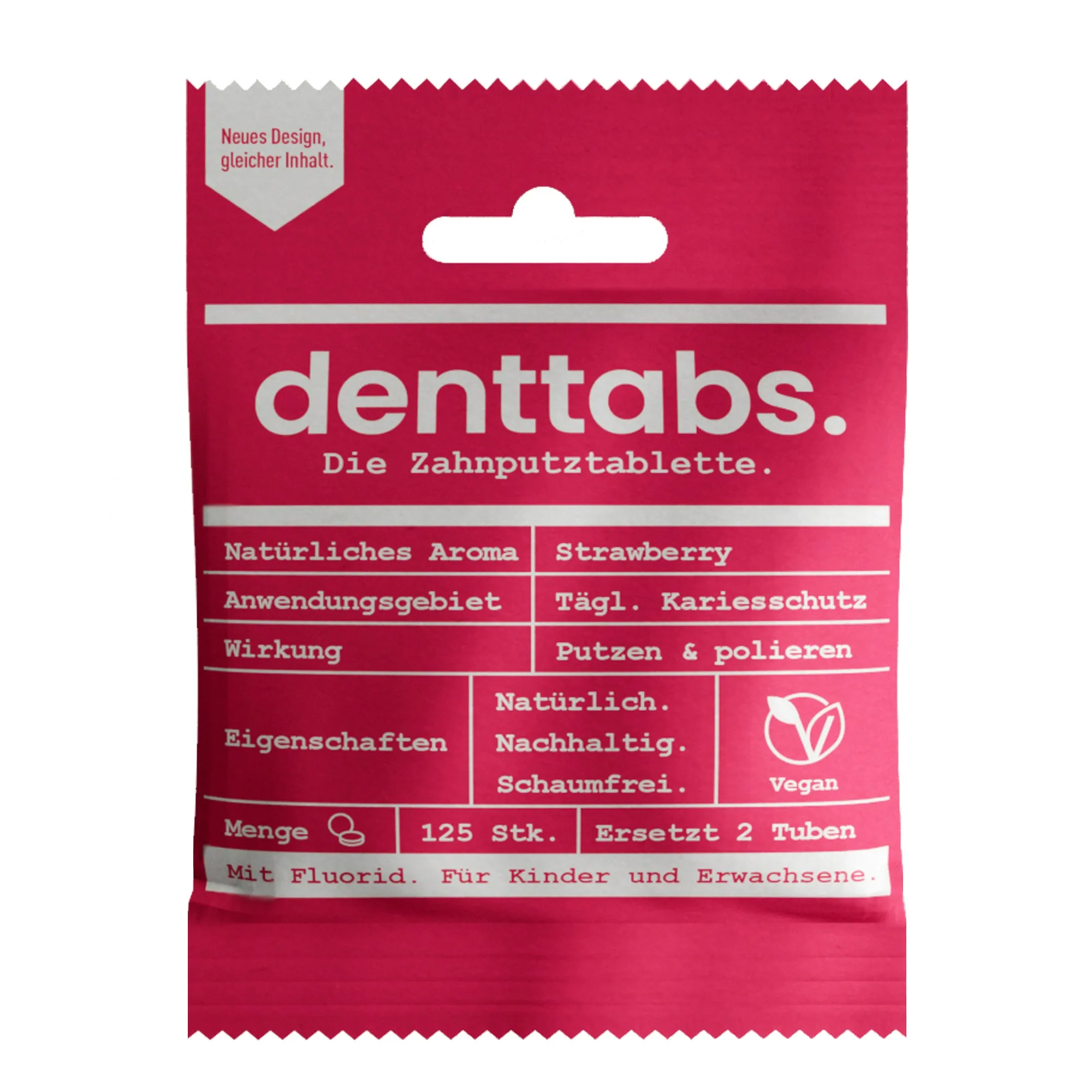
The most important step was the packaging. Instead of an image world it got a table: flavour, area of use, effect, properties, quantity, one line each, set in a typewriter face on a single solid colour. Variants differ by colour, not by layout. Green is mint, red is strawberry.
That had two consequences. Printing dropped to two colours per pack, and packaging costs fell by more than 70 %, also thanks to tighter material specifications. And on the shelf the pack reads like a package insert: factual, verifiable, without a promise you have to take on trust. For a product competing against the habit of the tube, that is the more credible voice.
The process: from manual to shelf
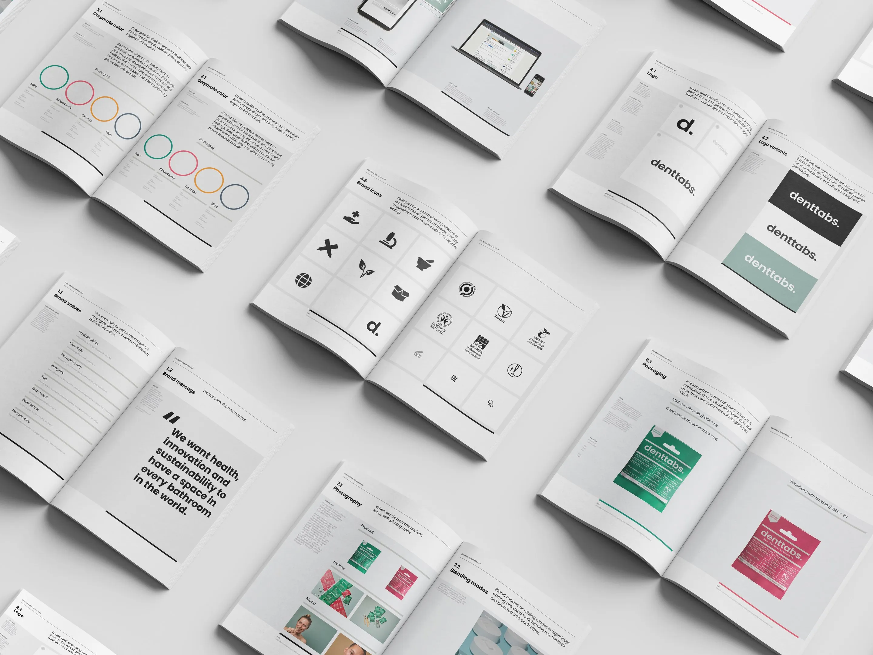
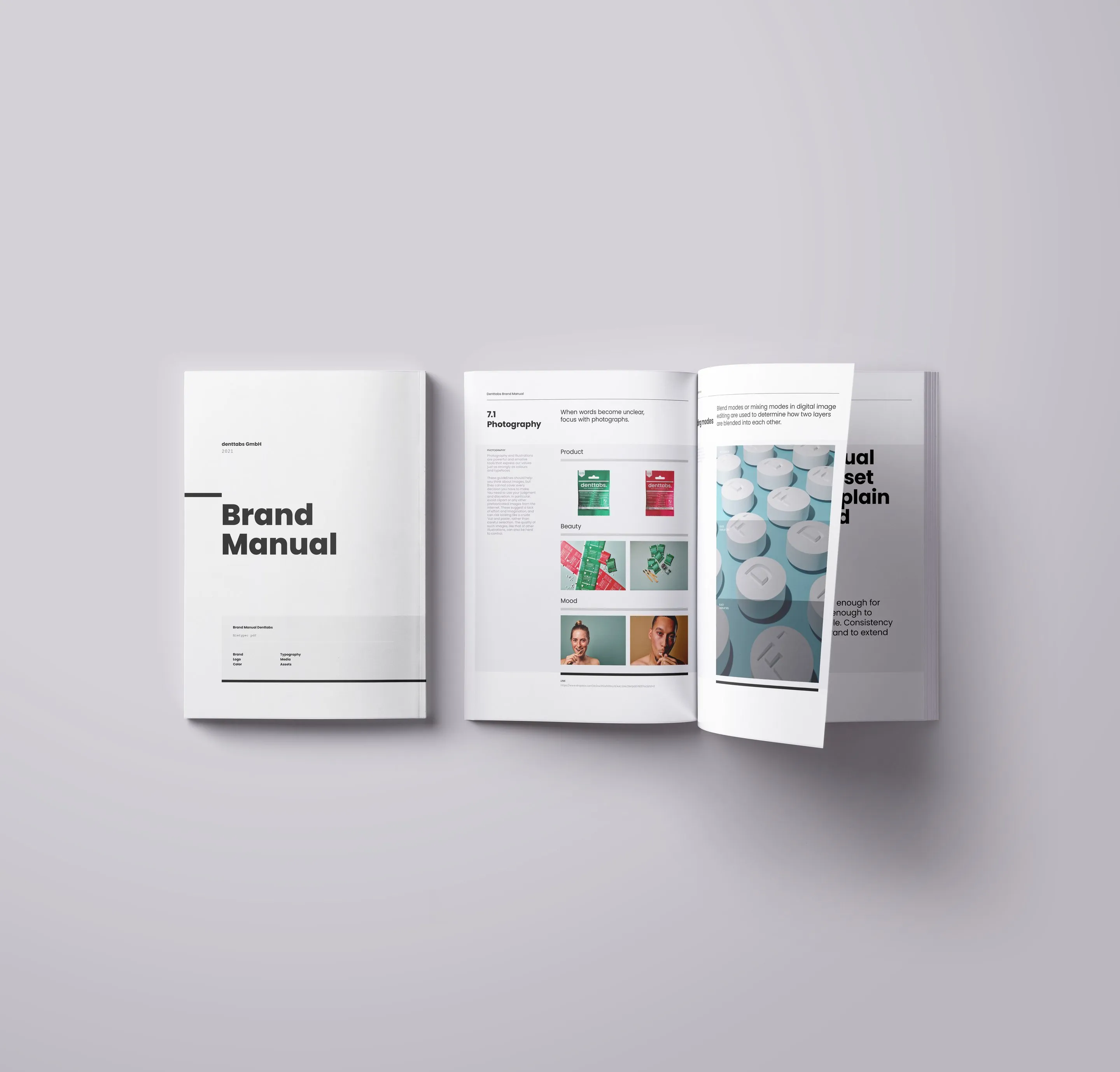
The packaging became the brand manual: typeface, grid, colour coding by variant, icons, image rules. I then carried the system into space — point-of-sale displays, trade fair stands, shop fixtures and signage — and into templates for print and digital channels that the team could keep working with on its own. I sat between founders, marketing and production, and a large part of the work was justifying decisions in a way that held up in all three departments.
The result
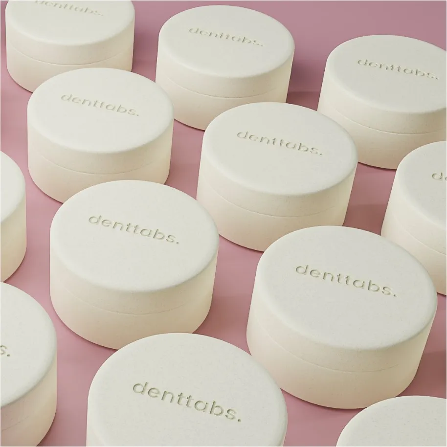
The full rebrand was complete after six months. The pack costs less, reads in a second on any shelf, and you recognise the variants by colour. What I took with me: a product that wants to change a habit doesn’t need a loud brand, but one that visibly has nothing to hide.