The default is the new style
Why software designs whenever nobody decides — and what designers can do about it
- Number
- Nr. 011
- Type
- writing
- Year
- File
- aljosha-insta-images.jpg
Anyone who wrote a letter in Word between 2007 and 2023 wrote it in Calibri. Before that it was Times New Roman; since 2023 the default font of Microsoft 365 has been Aptos, drawn by Steve Matteson. Hardly anyone chose any of these typefaces. Yet they shape countless pages: job applications, menus, notices in stairwells. My thesis: the most influential style of our time has no author. It emerges from defaults, and it can only be changed if you treat it like a found object.
Invisibility used to be a decision
In the twentieth century many designers wanted to disappear. In 1930 Beatrice Warde called for typography that, like a crystal goblet, shows its content and doesn’t draw attention to itself. The Swiss around Josef Müller-Brockmann put their own person behind the grid. In Kanon No. 001, “The goblet is cracked”, I described why that never quite worked: even the clearest goblet has a form, and someone chose it.
That last clause is the point that has shifted. Warde’s restraint was a stance you had to learn and justify. The restraint of a default is no stance. It is simply there when you open a program.
Gerstner invented the programme
In Programme entwerfen (1963), Karl Gerstner wrote that designers should design not individual solutions but rules from which solutions emerge. He was thinking of grids, type systems and combinatorics — and of designers who set those rules themselves.
Software adopted the idea and deleted the author. Every template, every theme, every style preset in a layout program is a programme in Gerstner’s sense: a rule from which countless results emerge. Only now it isn’t the designer who sets it, but a software company’s product team, years in advance, for everyone at once.
In Import/Export (2008), Lev Manovich described how compatible programs blend techniques from film, typography and 3D into a single visual language. Today I read his text as a description of a new kind of style: not from a school but from a workflow. What is easy in the common programs you see everywhere. What is hard you rarely see.
The kit looks like everyone else
The web shows this most clearly. In 2011 Mark Otto and Jacob Thornton at Twitter released a package called Bootstrap: grid, buttons, forms, type sizes, all ready-made. It was meant to save developers work, and it did. According to the survey service W3Techs, it now runs on almost one in five websites. Anyone wondering why so many sites resemble each other finds a large part of the answer here: they share the same defaults.
The same goes for dummy text. Lorem ipsum is a mangled passage from Cicero’s De finibus bonorum et malorum of 45 BC. It entered design studios on transfer sheets and reached every screen with the first layout programs. It is the default for content, and it has a consequence: whoever designs with dummy text designs a form before knowing what it is supposed to carry.
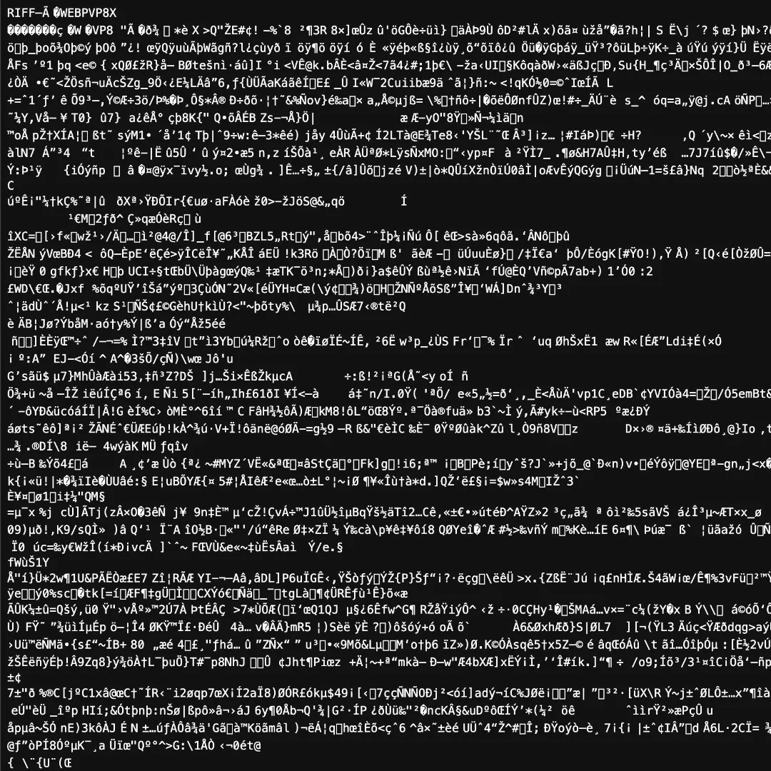 Fig. 1 — A WebP image file opened as text. “RIFF … WEBP” is still legible at the top; the rest is mojibake: the editor reads the bytes with its default character encoding. Only when a default doesn’t fit do you notice there is one.
The statistical middle
With generative AI, the default becomes total. Without further instruction, a language model or image generator delivers the most probable answer — the middle of all the texts and images it learned from. In No. 009, “The machine delivers the average”, I described how to work with that. Here the concern is what it means for style.
Until now, every default at least had a place where it was decided: a design team at Microsoft, two developers at Twitter. With a model, that place no longer exists. The middle is the outcome of millions of decisions nobody made together. It is the most complete invisibility there has ever been, and it isn’t neutral. It favours the frequent, the pleasing, the already seen.
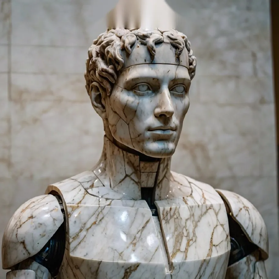 Fig. 2 — Marble Machine I, from an AI image series in the archive: antique bust, robot, marble. Three familiar motifs, combined without instruction, add up to a picture you think you already know.
The default as found object
What follows? Not that you should avoid defaults. That’s neither possible nor sensible. Calibri is a decent typeface, Bootstrap a good tool, and an AI shows in seconds what is obvious. What follows is that you have to see them.
My method, Readymade ± 3 %, treats the found object as material: you take a thing everyone knows and shift it within its tolerance until its meaning tips. The default is the readymade of our time. It is the thing everyone knows so well that nobody notices it any more. That is exactly why it lends itself to a targeted intervention. A default typeface, chosen deliberately and shifted by one weight, says something different from the same typeface used out of convenience. A grid from the kit, broken at a single point, shows that someone looked.
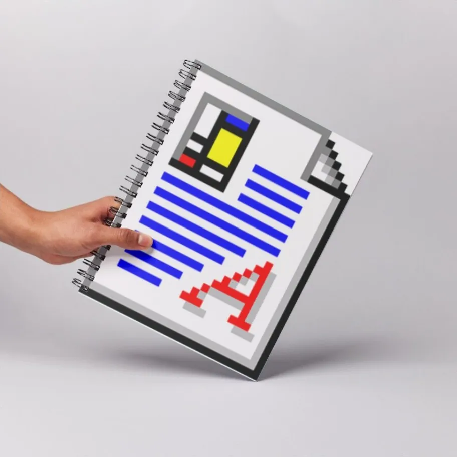 Fig. 3 — The document icon as an object: a default so familiar that you only notice it once you hold it in your hand.
The difference between style and default lies not in the result but in the decision. Two pages can look the same. On one, someone chose; on the other, nobody did. Design begins at the point where you replace the second with the first.
Tomorrow, open a blank file and read it before you write. Everything already there was decided by someone else.