You measure legibility, you don’t argue about it
Six tests that turn an argument about type into a measurement
- Number
- Nr. 012
- Type
- writing
- Year
- File
- kachel-lesbarkeit-messen.jpg
In meetings, people argue about type the way they argue about taste. One finds the grotesque too cold, another the roman too old-fashioned, and in the end whoever talks longest decides. Yet legibility is one of the few qualities of design that can be measured. Not completely and not without limits, but well enough to turn an opinion into a number. You don’t need a lab. A stopwatch is enough, five people, and the discipline to change only one thing at a time.
First decide what you are measuring
The word “legible” covers two different things. The typographer Walter Tracy pulled them apart in 1986. Legibility is about recognition: how quickly and reliably can you see which letter, which word is there? It matters on a road sign, a display, a label you read in passing. Readability is about reading: how effortlessly do you get through twenty pages of text without tiring?
A typeface can be good at one and bad at the other. A condensed grotesque in capitals is instantly recognisable on a sign from ten metres away and an imposition in a novel. So before you test, decide which question you are asking. Everything else follows from that.
One variable, not five
From the 1920s onwards, the American psychologist Miles Tinker spent more than three decades measuring how people read printed text. He varied type size, line length, leading, typeface and the colour of type and paper, one at a time, with everything else held constant. He summarised his results in 1963 in Legibility of Print. The most important thing about it is not any single finding but the method: if you compare two designs that differ in typeface, size and colour at once, you won’t know afterwards what made the difference.
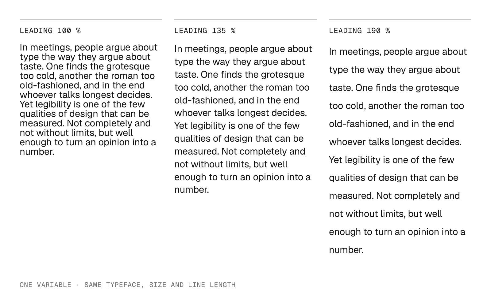
Fig. 1 — The same paragraph, the same typeface, the same size. Only the leading has changed. Only then can you say what makes a difference.
Six tests, from quickest to most thorough
1. The squint test. Look at the set page from two metres away or with half-closed eyes. The letters blur and what remains is the typographic colour. Good setting produces an even surface. Holes, pale rivers running vertically through the text and dark clots show up immediately. On screen, a blur filter does the same.
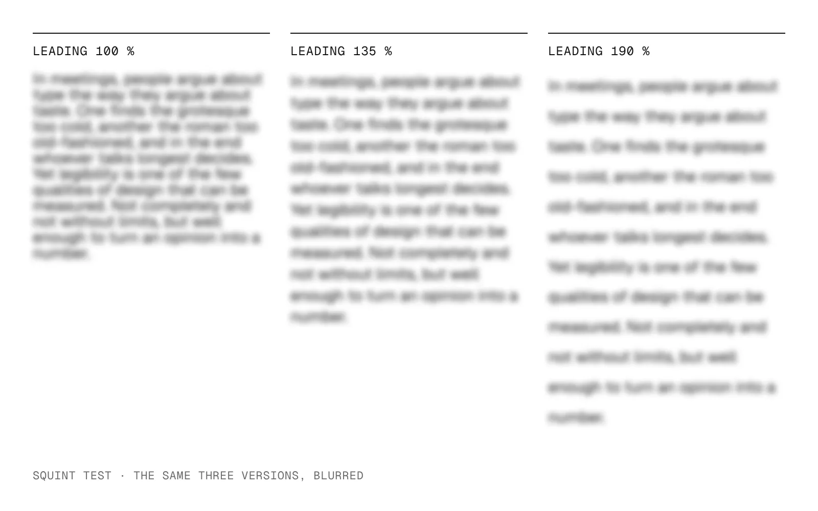
Fig. 2 — The three versions from Fig. 1, blurred. The tight setting becomes a dark block, the loose one falls apart into stripes. What you only sense in the detail, you see in the blur.
2. The original test. Print at original size, read in the original light, at the original distance. A poster checked on a monitor at 30 per cent zoom has not been checked. The same goes for an app only ever seen on the designer’s large screen.
3. The reading-time test. Five people read each version and you time them. Then two or three questions about the content. Tinker built comprehension into his tests so that nobody could read faster than they understood. If you only measure time, you measure skimming. Five people are not a study. But if four out of five are clearly faster with one version and answer the questions correctly, that is more than an impression.
4. The glance test. For anything read in passing: show the word for half a second, cover it, then ask what was there. In 2014 a research group at MIT used a driving simulator to compare two typefaces on a menu interface. With a humanist sans serif, the men among the participants needed a good ten per cent less glance time for the same menu tasks than with a square, technical-looking typeface. Ten per cent less looking at the display is ten per cent more looking at the road.
5. The distance test. For signs and wayfinding: from the distance at which it is meant to be read, and a little beyond. The question is not whether you can read it when you know what it says, but at what point someone who doesn’t know reads it correctly for the first time.
6. The long test. For books, reports, long articles: one person reads for twenty minutes at a stretch and then says when it became tiring. Tinker filmed eye movements for this. In practice, an honest answer to the question of when you started reading lines twice is enough.
You read best what you read most
The method has a limit, and it is fundamental. Zuzana Licko, co-founder of Emigre, summed it up in a single sentence. As Gerard Unger renders it: you read best what you read most. Unger, the type designer and legibility researcher, took this seriously. Legibility is not a fixed property of a form but to a large extent habit. Blackletter was the familiar reading type in Germany for centuries, and those who grew up with it read it without effort.
So a test always also measures what the participants already know. An unfamiliar typeface almost always loses the first round. That doesn’t mean it is worse, only that it is new. And some texts are not meant to be read quickly at all: a poem, a manifesto, a poster that holds you up for a moment. For them the fastest version is not the best. The dispute between Beatrice Warde’s invisible typography and the loud roadside sign, which no. 001 is about, cannot be settled with a stopwatch.
So measuring doesn’t replace the decision. It only changes what you argue about. Instead of “I find this typeface nicer”, it becomes: this version is twelve per cent slower for our readers, and we are choosing it anyway because the text is meant to be read slowly. That is a reasoned position.
What the test does not do
The tests described here show a direction, not a proof. Five people are enough to see rough differences, not to establish them. Robust statements require more participants, a varying order of versions and a comparison of the difference with the spread between individuals. It also remains open how to factor out habit when a new typeface competes with a familiar one. As long as that cannot be done, every legibility test also measures what readers already know.