Every design uses a bias
On cognitive biases that designers don’t avoid but deploy every day
- Number
- Nr. 008
- Type
- writing
- Year
- File
- bias_1.jpg
The usual texts about bias have a friendly, slightly preachy tone. We all have prejudices, they say; we should recognise and reduce them, and then we’ll make better decisions. That holds for job interviews and court rulings. For designers it is an odd recommendation. A good part of our profession consists of triggering cognitive biases on purpose.
The number that comes first
In 1974 Amos Tversky and Daniel Kahneman had participants spin a wheel of fortune that stopped at either 10 or 65. Then they asked them to estimate the percentage of African countries among UN members. Those who had seen 10 estimated 25 percent on average. Those who had seen 65 estimated 45. The wheel had nothing to do with the question, and still it pulled the answer. They called this anchoring.
Every pricing page I know works with it. The crossed-out price above the sale price is an anchor. The most expensive package on the left of the table is an anchor. The order of options is a design decision, and it is never neutral.
The image that colours the rest
In 1920 Edward Thorndike observed that officers rated their soldiers similarly across all qualities: whoever looked good was also considered reliable and intelligent. He called it the halo effect. Branding is, at its core, an attempt to produce a halo. Beautiful packaging is meant to make the product taste better. A carefully typeset proposal is meant to make the supplier seem more serious.
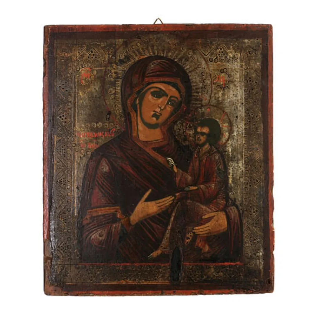 Fig. 1 — The halo the effect is named after: a glow around the head colours how you see everything else about the figure.
That isn’t reprehensible. It is the reason design is worth anything economically. But it should be said out loud. Whoever claims good design merely makes things easier to understand is keeping quiet about half its effect.
The option that exists only to make another look good
In 2008 Dan Ariely reported on an offer from The Economist: online for 59 dollars, print for 125, print and online for 125. Nobody wanted print only. It was there so that the bundle looked like a gift. When he re-ran the offer with students, most chose the expensive bundle while the print-only option was there. Without it, the ratio flipped. That is the decoy effect, and it hides in a great many three-column pricing tables.
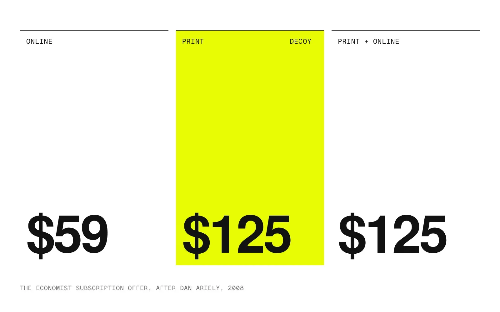 Fig. 2 — The Economist offer, redrawn. Print alone costs as much as print and online. Nobody is meant to choose it; it is there so the bundle looks like a gift.
The line
If design works with bias anyway, the question is not whether but what for. For me there is a simple test: would the user make the same decision if they knew how the page was built? An anchor that makes the fair price of a good product visible passes the test. A decoy whose only purpose is to push people into the most expensive package fails it. The difference lies not in the technique but in the intention.
The same goes for one’s own bias. I see a readymade in every thing — something that can be shifted by a few percent. That is a distortion, and I use it deliberately. It lets me see things others pass over, and it makes me overlook others. Whoever knows their bias can steer it like a tool. Whoever believes they have none is steered by it.
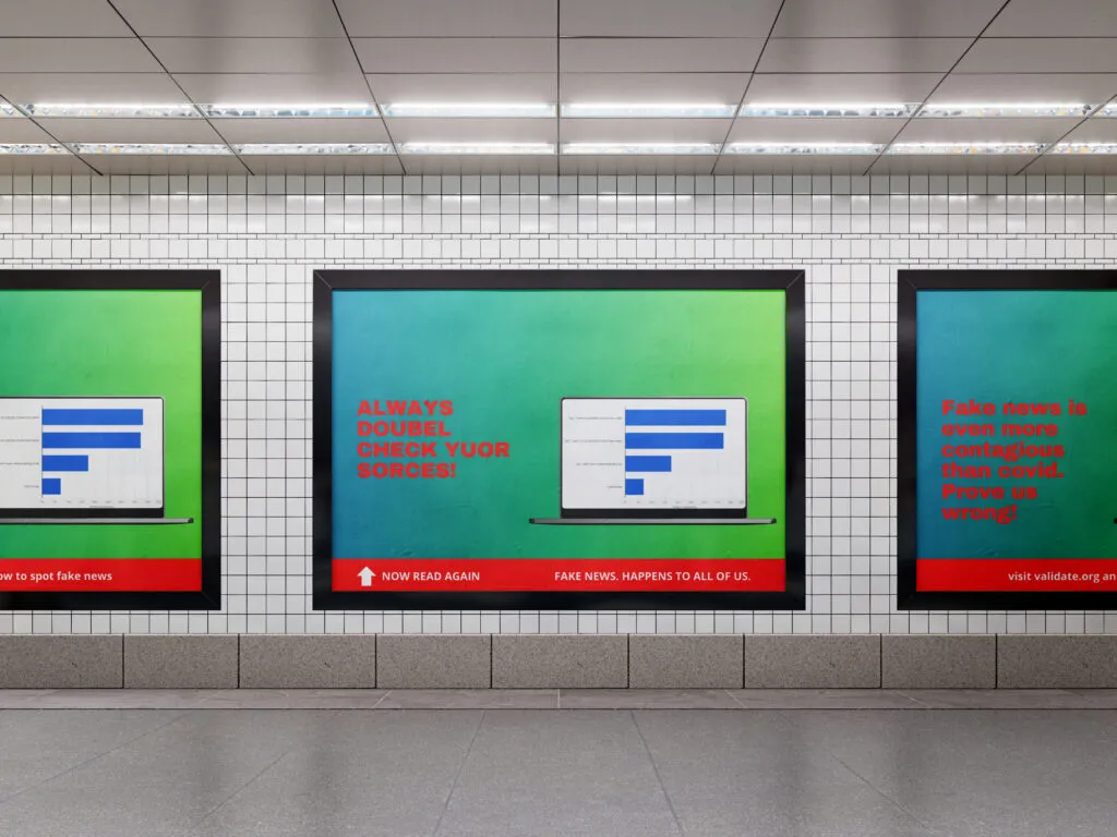 Fig. 3 — Posters against fake news: “Always doubel check yuor sorces!” You read past the typos at first glance; underneath it says “Now read again”. The poster uses exactly the distortion it warns against.
Open the next pricing table you design and write under each column who it is really there for.